1962 Uniform Code of Operating Rules – Automatic Block Signal System Rules

AUTOMATIC BLOCK SIGNAL SYSTEM RULES

505. Block signals, cab signals, or both govern the use of the blocks but do not supersede the superiority of trains unless Rule 251 or Rule 261 is in effect. They do not dispense with the use or observance of other signals whenever and wherever required.

506. When an interlocking is in use in ABS territory, interlocking rules govern movements through the interlocking.

507. When signals in ABS territory are withdrawn from service trains will be governed by instructions from the train dispatcher.

508. A station protection signal affords protection against all trains in the direction in which the signal applies, and movements may be made in either direction in the block at restricted speed. When a station protection signal does not form part of an ABS, protection extends only to the “Block End” sign, and Rules 512 and 513 must be observe.

Where approach signals are not provided, approach signs will be placed one mile from station protection signals.

509. When a train or engine is stopped by a signal indicating “STOP” and no conflicting movement is evident:

(a) A member of the crew must immediately communicate with the train dispatcher, stating his name, occupation, location and train or engine number.

(b) On information from the train dispatcher that there is no conflicting train movement, the train or engine may proceed at restricted speed to the next signal.

(c) If unable to secure the information that there is no conflicting train movement, it may proceed only under flag protection (as prescribed for OUTSIDE ABS TERRITORY) to the next signal displaying a less restrictive indication than Stop or Stop and Proceed.

(d) Instruction received from train dispatcher must be in writing and repeated before being acted on, and train dispatcher must make the proper record immediately.

510. A train or engine which is to enter a siding or yard track at a point where the switch to be used is not more than 500 feet beyond a Stop and Proceed signal may pass such signal at restricted speed without stopping provided the switch is lined for the track to be used and the track between the signal and the switch is seen to be clear.

512. Where block indicators are provided, the indicator must be observed immediately before a main track switch is opened. When indication shows “track occupied” the switch must not be opened unless the movement is protected as prescribed by Rule 99 for OUTSIDE ABS TERRITORY, except at meeting points on single track when the train to be met has cleared the switch and is occupying the block. The indication “track unoccupied” does not authorize a train or engine movement, and does not relieve employees from protecting their train or engine as prescribed by the rules.

513. Where block indicators are not provided or when declared out of service, a train or engine which is to foul or enter a main track from a crossover, siding, or other track, must wait three minutes after the main track switch has been opened before moving foul, except at meeting points on single track when the train to be met has cleared the switch and is occupying the block. This will not relieve employees from protecting their train or engine as prescribed by the rules.

514. A train or engine entering a block between signals must be protected as required by the rules and must proceed at restricted speed to the next signal unless the track is seen to be clear to the next signal and such indicates proceed.

EXCEPTION: This rule does not apply in CTC when entering a block in CTC where an electrically-locked hand operated switch is provided.

515. When a train or engine has passed a signal permitting it to proceed at other than restricted speed and is delayed in the block, it must proceed at restricted speed to the next signal unless the track is seen to be clear to the next signal and such indicates proceed.

516. A train or engine having passed beyond the limits of a block must not back into the block except under protection.

517. If any part of a train or engine overruns a signal indicating STOP, front of train or engine must be protected immediately under Rule 99 for OUTSIDE ABS TERRITORY, and member of crew must immediately communicate with train dispatcher and be governed by his instructions.

518, To avoid holding main track signals at stop, cars or engines must not be allowed to stand between the standing point and a main track switch.

Recent Posts

Evolution of an Image – CP Freight Car Paint Schemes

Like any company or institution that’s been around for a long time, Canadian Pacific has gone through a number of image and branding changes over the years. This article will look at the various rolling stock paint schemes used by Canadian Pacific over the last century.

Early Block (<1951)

CP’s lettering standard from the early half of the 20th century featured the Canadian Pacific name in simple gothic block lettering. There were variations in how this lettering was positioned depending on the car type or era, but they all used the same stencils and this was more or less standard from at least the WWI through WWII periods.

CP Spans the World (1947-1951)

Starting in 1947, this “CPR Spans the World” herald and slogan were introduced by CPR’s marketing highlighting CP’s steam ship connections that connected the railway to Europe and Asia. A number of boxcars repainted during 1947-1950 received this herald prominently applied to the right of the car side. Otherwise, the lettering was identical to the previous standard “block” lettering scheme, just with the addition of the “Spans the World” herald.

Due to the size and prominence of the herald, this was only applied to boxcars, with no change to the paint scheme on any other type of car.

Stepped Gothic (1951-1962)

CP’s standard boxcar scheme throughout the 1950s featured the railway’s name in “stepped” offset rows on the right hand side of the car, with the “CPR” initials prominently emphasized. Even though unaffiliated with the CPR at the time, the Pacfic Great Eastern and Toronto, Hamilton & Buffalo railways would also copy this idea, introducing their own similar lettering schemes with stepped lettering.

Like the late 1940s “Spans the World” graphic, this was only applied to “house” cars like box cars and refrigerators, with other car types like hoppers, gondolas, and cabooses continuing to carry the simple block lettering above.

A minor change to this scheme would come in 1957 when the horizontal white lines above and below the car number, previously an AAR standard, were discontinued.

The Script Era (1963-1969)

CP had used a version of script lettering in marketing logos going back to the early 20th century, but in the early 1960s the script lettering was revised and the railway’s image updated to make wide use of it as their primary branding, applying the new lettering to locomotives, freight cars, cabooses, ships and trucking divisions, and all company paper work.

Freight car colours remained the same: brown for box and other “house” cars, and black for open cars like flatcars, gondolas, and hoppers. Cabooses remained brown with red ends. Only the logos applied to the cars changed.

This lettering change was applied to most car types on the CPR except for flatcars, which continued to use the simple block lettering as the script lettering would not fit on this type of car. Also while some groups of new gondolas delivered later in the 1960s were delivered in the new script lettering, CP shops were loath to actually do any painting of the script lettering over car ribs, and there is little or no evidence of actual CP shop repaints of any cars with external bracing with script lettering.

A Colourful Introduction (1967-1968)

Starting in 1966 CP started to modify their script scheme for several large purchases of new freight cars in the late 1960s. The size of the reporting marks and car numbers were increased and the font modified slightly. They also introduced bold colour coding to several types of cars (mainly box type cars).

New mechanical refrigerator cars were painted silver with red lettering. Insulated heated boxcars were painted a striking yellow-orange with red script. And a large group of boxcars dedicated to paper service were delivered in a jade green scheme with a large pine tree graphic.

Cabooses also got a colourful upgrade, with several cabooses repainted during this period into a bright red with yellow ends. However due to the short-lived period these paint schemes were applied, no existing freight cars are ever known to have been repainted in similar schemes to any of the above cars. These schemes only appeared on newly built cars.

Flatcars, gondolas, and hoppers (other than a group of pressure-differential unloading hoppers which were painted in a silver and black scheme) remained black, but deliveries from around 1967 can be noted for the subtle change in the reporting mark/number font and size.

The CP Rail Era (1969-1987)

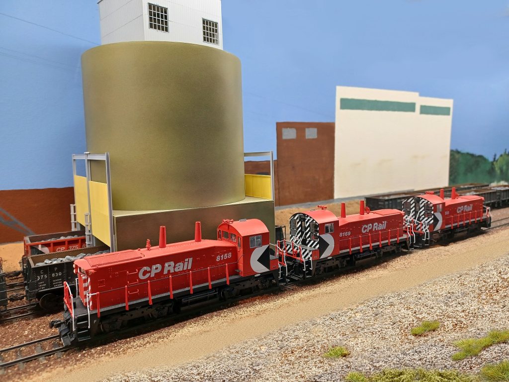
In October 1968, Canadian Pacific introduced their most radical rebranding in company history. All of the company’s divisions dropped the classic script lettering, and adopted a unified branding with a new name consisting of the parent company’s “CP” initials followed by the division name, and new logo called the “MultiMark”, with each division using the same logo but with their own colour. Canadian Pacific Railway became “CP Rail”, and adopted red as their primary colour. (The specific shade of red to become known as “Action” red.)

On the railway, this lead to a radical change in the colour landscape, with maroon and grey locomotives giving way to red (although note the black locomotive model in lead graphic in this section – this was the original proposal which CP management rejected) and brown and black freight cars shifting to brighter colours.

Locomotives and most freight equipment (boxcars, gondolas, and flatcars) was painted in the CP Rail “Action Red” colour which was adopted as the railway’s primary colour, matching the locomotives. The company’s bold new black and white “MultiMark” logo was applied at one end of the car covering the full height of the car side. (The paint standard had the MultiMark at the “B” (handbrake) end of the car, although many boxcar repaints just put it to the left of the car side as it was easier to mask over a pair of grabs than a full ladder.) Early box car repaints featured a contrasting black lower sill, which was dropped on later repaints which just kept the lower sill the same colour as the rest of the body.

Several other colours were used however. Following the colour coding introduced with the 1967 schemes above, paper service assigned boxcars received a green paint scheme, insulated heated cars as well as cabooses were yellow, and refrigerator cars were painted silver. Hopper cars were still painted black. The last two car types received a modified version of the MultiMark, with Action Red used instead of black for the triangle in the logo.

Interestingly, the “CP Rail” brand also started a trend among other unrelated Canadian Railways, with British Columbia Railway renaming itself “BC Rail” in the early 1980s, Canadian National briefly experimented with “CN Rail” branding in the late 1980s, and Ontario Northland introduced a bold new “ON Rail” image for their locomotive paint scheme in the early 2000s.

The Loss of the MultiMark (1987-1996)

The MultiMark logo lasted for almost 20 years before CP decided to remove it from their branding in late 1987. (The first locomotive to be outshopped in a new paint job without the MultiMark was in November 1987.)

While the “CP Rail” name and branding would still last another decade before reverting back to a version of “Canadian Pacific” branding, the MultiMark symbol was now a thing of the past. In the early 1990s, CP would modify their CP Rail logo to “CP Rail System” featuring a split Canadian and US Flag (known to railfans as the “Dual Flags” scheme), although this logo is not known to have ever been applied to freight equipment, only locomotives and maintenance vehicles.

The Return to Canadian Pacific (1997-2023)

In 1997 CP finally retired the “CP Rail” brand for good, moving to a modern interpretation of the Canadian Pacific Railway name and classic beaver herald. There would be some experimentation, with the beaver logo occasionally being dropped and restored and going through some minor styling updates, but this would more or less be CP’s branding until the 2023 merger with Kansas City Southern to form CPKC Railroad, which currently uses a modified version of the CP beaver logo with the CPKC initials instead of CP.

  1. In Memorial: Jim ‘Skid’ Robinson Leave a reply
  2. 2025 Fall Open House Leave a reply
  3. 2025 Doubleheaders Layout Tour – Saturday March 29th, 2025 2 Replies
  4. Out With the Old, In With the New 3 Replies
  5. Falconbridge Nickel Mines Railway Leave a reply
  6. INCO Ore Operations on the Sudbury Division Leave a reply
  7. State of the Layout – March 2024 Leave a reply
  8. WRMRC Fall Open House – Saturday 14 October 2023 Leave a reply
  9. Begin/End CTC Romford 2 Replies