This article was originally published in the Canadian Pacific Historical Association’s *CP Tracks* magazine (Vol 10 – No 4). It has been reproduced here to chronicle what was a massive corporate image change for the CPR, and as a guide for hobbyists who wish to model in the Action Red era.
If there were one word that could best describe the year 1968, it would have to be radical. This of course was the year which saw the assassinations of Martin Luther King and Robert Kennedy, the fabled ‘Prague Spring’ and resulting crackdown by the USSR, the rioting at the Democratic National Convention, the full horror of Vietnam was in everyone’s living room, and the resulting demonstrations which culminated in the shootings at Kent State. On a lighter note, it was also the height of the ‘British Invasion’ of popular music, a dramatic year for NASA’s moonshot ‘Apollo’ program, and the beginning of ‘Trudeau-mania’; undeniably all radical events in their own ways.
Those feelings of radical change even seemed to spill into the railway industry as this was the year of the mega-mergers, and saw the beginnings of Seaboard Coast Line, Penn Central and Burlington Northern. On top of this, there were several proposed mergers including; Chesapeake & Ohio with N&W, Illinois Central with the Gulf Mobile & Ohio, UP versus CNW for the Rock Island, and CNW with the Milwaukee Road. Fortunately the collapse of PC put all mergers into question and only the IC-GM&O proposal went through.
With all these radical events unfolding throughout 1968, it’s easy to forget that the management within Canadian Pacific decided to undergo a radical change of corporate identity themselves. Whether it was due to the attitudes of the times, or just to counter Canadian National’s dramatic image change of 1960, the decision to scrap the ages old CP beaver shield along with the traditional maroon and grey colours was final. The only question was what to replace it with?
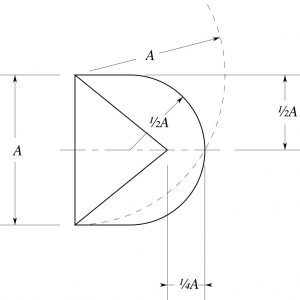
Geometric layout of the CP Multimark logo.
It should be noted that this was a change of corporate image, not simply a new paint scheme for the railway’s locomotives. The new image would be applied to all aspects of Canadian Pacific Limited, from airplanes, to ships, to trucks, to hotels, to real estate, and to the railway. For this purpose, CP turned to the noted New York advertising agency of Lippincott & Margulies, known in the railway circles for coming up with the ‘Big Sky Blue’ imagery of the Great Northern, and later the corporate logo and colours of the new Burlington Northern. The final product was a drastic departure from CP’s traditionally conservative imagery.
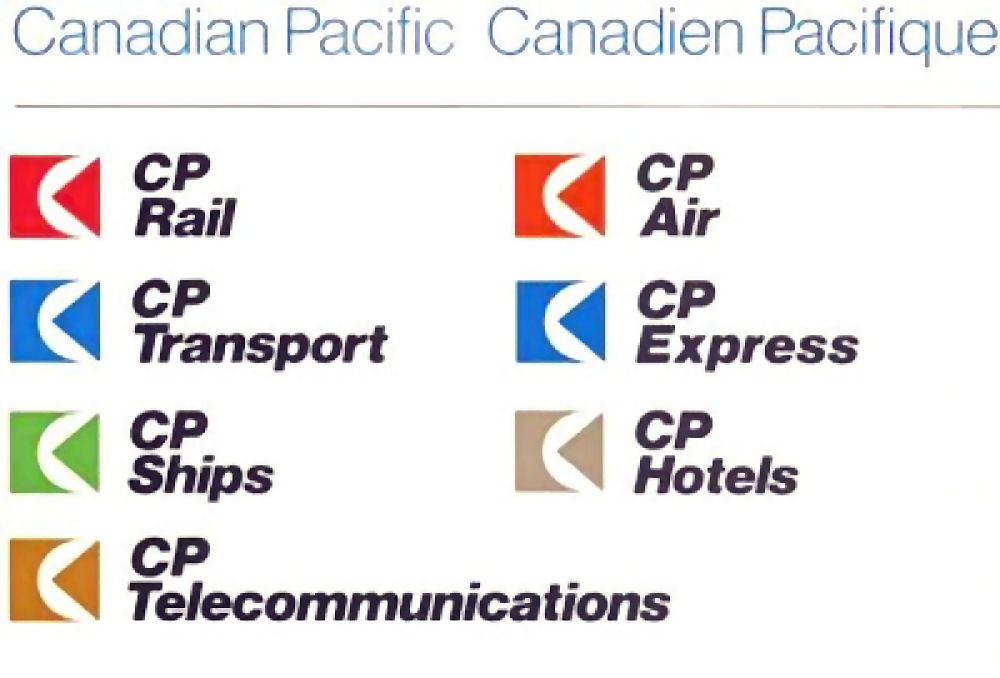
To begin, the name Canadian Pacific was discarded, and new CP acronyms were created for each corporate division; CP Air, CP Ships, CP Express, CP Transport, CP Hotels, and of course CP Rail. The lettering style chosen for these new acronyms was that modernistic ’60s font; Helvetica. Holding company Canadian Pacific Limited was represented in plain Helvetica font, but all CP divisions featured it bolded and italicized. Also, the old beaver shield was shed and replaced by a new corporate logo, coined the Multimark. This geometric symbol was a simple rectangle overshadowed by a white half-circle, with a triangle on-edge piercing the ensemble.
The image may seem simplistic and almost childlike to many railway buffs, but it was meant to convey a variety of universal connotations to the casual viewer. The rectangle denoted stability and longevity, while the circle represented the globe and CP’s multinational nature. Officially the triangle signified the companies progressiveness and motion, however it also instilled the imagery that it was about to encircle the globe, a reminder of CP’s old corporate slogan “Spans the World”.
Each division of Canadian Pacific in turn received their own colours for their equipment to wear; green for CP Ships, orange for CP Air, blue for CP Express and CP Transport, and red for CP Rail. The red chosen for the railway was a vibrant shade mixing orange and red (similar to vermilion), and was coined ‘Action Red’ by Lippincott & Margulies.
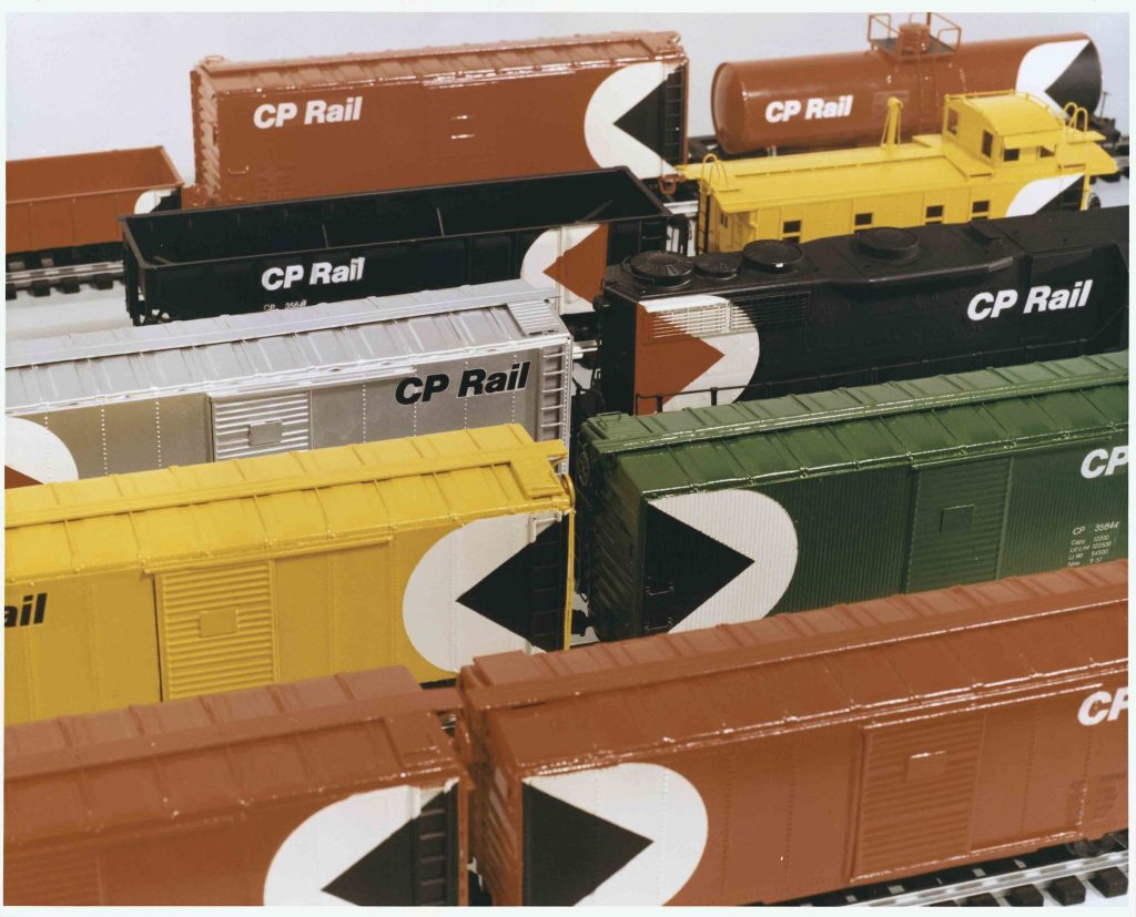
Though ‘Action Red’ was chosen for the railway division, not all equipment was to be painted red. Lippincott & Margulies envisioned that different car types would each have their own colour, and painted a number of O-scale models to demonstrate the concept.
Though red was chosen as the dominant colour for the railway, not all equipment was to be painted red, and various car types would feature their own colours. Red would be used for general service cars, green for newsprint service, yellow for insulated cars, silver for mechanical refrigeration, black for bulk commodities, and yellow for the caboose. Indeed, an almost forgotten fact was that the original recommendation from Lippincott & Margulies was to paint CP Rail’s locomotives black, with a white and red multimark – yes the same way their hoppers were painted. An O-scale GP35 locomotive was even so painted by the ad agency to demonstrate the scheme.
Ad agency Lippincott & Margulies painted this O-scale GP35 as part of their advertising pitch for the new CP Rail image. The original idea was black locomotives, with a white and red Multimark. Thankfully the CPR president wasn’t impressed, and ordered they change it to red.
Apparently CP president Norris R. Crump was not happy with their choice of colours, and was reported to have mumbled something to the effect of ‘paying thousands of dollars for these units, so we’re not going to paint them black’ (reportedly profanity was also involved). Upon his insistence, the scheme was quickly changed to red, with a white and black Multimark, matching the colours chosen for boxcars. On a personal note, I thank Mr. Crump to this day for his attention to imagery and his choice of red. Can anyone envision what CP’s locomotives would have looked like if they stuck with black, especially after they dropped the Multimark in the late ’80s? It would have made Norfolk Southern’s diesels look elaborate.
While the thought, creativity and marketing behind this imagery was certainly ingenious and innovative, it must also be viewed in a historical context as a failure. Despite its use on the sides of everything from boxcars, containers, aircraft and hotel entrances around the world, most people off the street would identify the symbol as ‘Pacman’. Indeed many railfans now incorrectly identify CP’s 1968 adopted Multimark, as this Atari video game character created in 1979. Contrast this with CN’s effective yet simple ‘Wet Noodle’, voted recently as one of the top-50 international corporate logos of all time. Show that CN noodle to anyone from Gander to Prince Rupert and they will correctly think of Canadian National and trains. Could the same be said of the CPR if you showed them the Multimark? Sadly, the only surprise from CP dropping the ‘Multi’ as their logo in 1987, was that it was not done sooner.
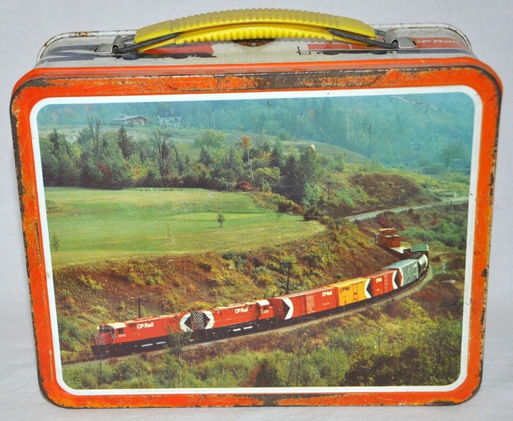
The Multimark appeared on everything Canadian Pacific owned; on trains, airplanes, ships, trucks, overseas containers, hotels, and resorts. You could even buy a lunchbox with new CP Rail trains and airplanes featured on them. Sadly, when shown the logo now, most Canadians would probably identify it as Atari’s video game character ‘Pacman’.
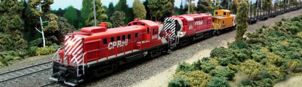
The first locomotive painted in the new Action Red CP Rail scheme was C-424 #4242, with sister #4239 following right behind in September of 1968. They were soon accompanied by nine different freight cars, each painted in their appropriate action colours; a green 50’ newsprint boxcar, a silver mechanical reefer, a black cylindrical hopper, a yellow insulated-heated boxcar, a 50-foot 202000-series double door boxcar, a 40’ NSC boxcar, a 53’ mill gondola, and 53’ flatcar all painted in general-service action red. There was also a yellow caboose numbered CP 438850, which was former streamlined cupola van #437450, freshly rebuilt by Angus with a new wide-vision cupola. This was the first of a long line of new ‘saddle-back’ vans constructed by the CPR.
The new colours were officially unveiled in Montreal on 03 October, 1968. Shortly thereafter the 4242 and 4239 were enlisted to pull this diminutive nine-car train across the system to display the new image to the nation. Most readers have probably seen the famous Nicholas Morant publicity shot of 4242 and 4239 pulling this train through the spiral tunnels in Yoho, BC. This picture was posed, and the train was split to give the appearance that the freight was coiled inside the tunnel and crossing underneath itself, but there were in fact only nine cars.
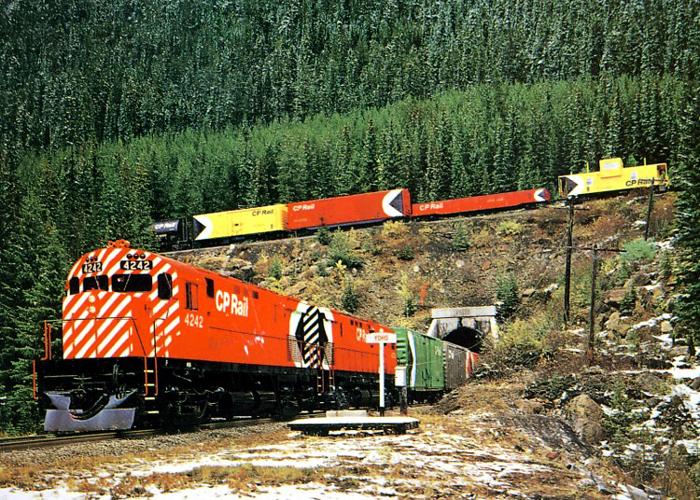
CP new image display train posed at the spiral tunnels in Yoho, BC. Despite it appearing to loop around itself, the display train was only nine cars long.
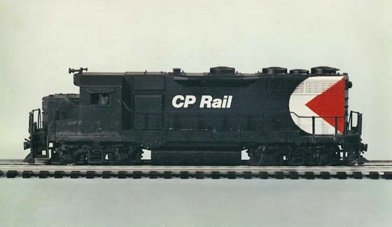
The initial CP Rail locomotive scheme is exemplified by Nicholas Morant’s publicity shots of 4242 and 4239. From the frame down, the locomotive was black, while the entire hood and cab sections were action red. The Multimark was positioned on the extreme rear of the engine, and was painted the full height of the unit. In this way the new action red scheme shared a similar trait as the old maroon and grey, both were direction dependant. For example, on locomotives that were set for long-hood forward operation such as an RS-3 or RS-10, the Multi was painted on the short-hood.
The CP Rail logo and cab numbers were painted white, in italicized bold Helvetica font. The CP Rail name was placed over the engine access doors, as forward as they possibly allowed towards the cab. They were also placed as high as the hood doors allowed. These features identified all early painted units, as over time it was found that lettering over hinges, louvers and handles was a pain. The CP Rail logo was soon lowered or moved over to avoid obstructions depending on the locomotive type.
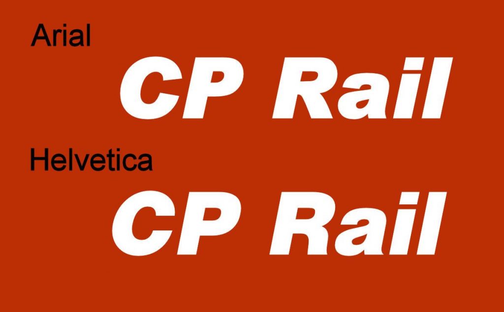
Anyone operating with MS Windows and wanting to create their own CP Rail heralds or decals may be tempted to use Arial font. Microsoft developed this as a Helvetica-based font to avoid paying royalties. It is close, but in a side-by-side comparison you can see the differences.
On the front of the unit, alternating 5” wide white and red angled stripes were placed over the entire nose, cab face and battery box fronts. When viewed head-on the striping lined up to give them a continuous flow. Painting the entire face of the unit in this narrow striping gave the locomotive a busy look, and it was quickly coined the ‘candy-stripe’ scheme by modellers and railfans alike.
On the rear of the unit, alternating 5” white and black (continuing the black from the triangle of the Multimark) striping was applied, and strictly to the hood section. On “DRF” class units (road freight) lacking numberboards on the rear hood, a white letter panel was painted near the centre with black road numbers applied inside.
All handrail stanchions were painted red, while the handrails themselves and all grabirons around the unit were black. On 4242 and 4239 the handrail runners up the access stairs of the units were red below the frame, and black above it. Later for safety reasons these runners were simply re-painted white, and all additional locomotives received this same treatment.

The first locomotive to be painted Action Red was MLW C-424 #4242, released from Angus shops in September 1968. Sister C-424 #4239 followed immediately after, and both powered the official CP Rail display train across Canada though October 1968. Photo courtesy cprdieselroster.
Over the course of the action red era, many of these features changed. Not only the position of the CP Rail, but Multimark sizes, striping thickness and application, rear number panel colours all changed. Finally, the Multimark was dropped in 1987, and action red was abandoned altogether in 1993; replaced by the deeper SOO Line instituted ‘System Red’ and the unimaginative dual-flag CP Rail System logo. By 1996, CP came to their senses and renamed the railway back to Canadian Pacific, and resurrected a new golden beaver shield. You can say what you want about the application of this scheme, but few would argue that Canadian Pacific currently has the classiest railroad logo in the industry.
Part two continues here: The Action Red Era (Part 2) – Locomotive Paint Scheme Variations